Composition is the placement or arrangement of visual elements or ingredients in the frame.
For example, if you want to take photo of a person, you can keep him/her in the middle, left, or right part of the frame. As the number of objects you want to cover your number of options to arrange them in the frame increases.
This arrangement can give dramatic effect in your photographs. You would have already experienced it.
There are few tips & tricks in this which you can learn very easily and practice.
I am covering some of those. Just read and apply one or two and you will definitely come back and learn the rest of those :)


Horizons placed very low in the frame heighten the isolation of subjects at the horizon. In isolating a lone person at the bottom edge of the frame at right, the photographer has created an atmosphere of emptiness by contrasting it with the vastness of the sky. Low horizons are effective, too, for capturing dramatic skies: colorful sunset-illuminated clouds, for instance.


Leading lines are most effective when there is some relation between line and subject, such as winding stone steps leading to a castle door. You can exaggerate their impact further by using a wide-angle lens and finding a vantage point close to the beginning of the lines—kneeling to get close to train tracks, for example.


Start trying these and wish you take wonderful photos :)
Tip : All the above rules are made to break too. Break it whenever you feel that would be better
For example, if you want to take photo of a person, you can keep him/her in the middle, left, or right part of the frame. As the number of objects you want to cover your number of options to arrange them in the frame increases.
This arrangement can give dramatic effect in your photographs. You would have already experienced it.
There are few tips & tricks in this which you can learn very easily and practice.
I am covering some of those. Just read and apply one or two and you will definitely come back and learn the rest of those :)
Rule of Thirds
Very simple and Very Effective
Imagine that your image is divided into nine equal segments by two vertical and two horizontal lines. Try to position the most important elements in your scene along these lines, or at the points where they intersect. Doing so will add balance and interest to your photo.
Most of the digital cameras even offer an option to superimpose a rule of thirds grid over the LCD screen, making it even easier to use.

The most important elements (the horizon and the haystack) are placed on or around the lines and points of intersection in this example.
More Examples
So next time when you take photo of your friend keep them on any of the two vertical lines instead of middle and see the difference
Balancing Elements
Placing your main subject off-centre, as with the rule of thirds, Creates a more interesting photo, but it can leave a void in the scene which can make it feel empty. You should balance the 'weight' of your subject by including another object of lesser importance to fill the space.

The figure in this scene is balanced by the rocks in the foreground.
More examples
Compositional Element
To attract and hold attention of the eye, a composition should have:
· an entry point
· an exit point
· elements that attract the eye
· balance between the elements.
The eye needs a place to enter a photograph that doesn't stop it cold. Sometimes it's the primary subject; sometimes it's something that leads the eye to the primary subject. Painters add other elements besides the primary subject to attract the eye further into a picture. Artistically inclined photographers do too by selecting to include them, as they frame a photograph.
In this picture entry point is the face of the deer and exit is through the horns. Remaining points you can make out.
Framing
The world is full of objects which make perfect natural frames, such as trees, archways and holes. By placing these around the edge of the composition you help to isolate the main subject from the outside world. The result is a more focused image which draws your eye naturally to the main point of interest.

The archway in this scene provides a natural frame for the ruin in the background.
Background
How many times have you taken what you thought would be a great shot, only to find that the final image lacks impact because the subject blends into a busy background?
The human eye is excellent at distinguishing between different elements in a scene, whereas a camera has a tendency to flatten the foreground and background, and this can often ruin an otherwise great photo.
Thankfully this problem is usually easy to overcome at the time of shooting - look around for a plain and unobtrusive background and compose your shot so that it doesn't distract or detract from the subject.

The plain background in this composition ensures nothing distracts from the woman's face.
Viewpoint
The unusual viewpoint of this photo makes for an interesting composition. Before photographing your subject, take time to think about where you will shoot it from. Our viewpoint has a massive impact on the composition of our photo, and as a result it can greatly affect the message that the shot conveys.
Rather than just shooting from eye level, consider photographing from high above, down at ground level, from the side, from the back, from a long way away, from very close up, and so on.
Create Depth
You can create depth in a photo by including objects in the foreground, middle ground and background. Another useful composition technique is overlapping, where you deliberately partially obscure one object with another. The human eye naturally recognizes these layers and mentally separates them out, creating an image with more depth.
The tree stump in the foreground adds depth to what might otherwise be a flat scene. Because photography is a two-dimensional medium, we have to choose our composition carefully to conveys the sense of depth that was present in the actual scene.
Filling the Frame
Make sure that you don't have acres of space full of nothing interesting and check for 'stuff' intruding into your masterpiece.
Sometimes your mind tends to exaggerate what you see through the viewfinder of your camera. You often perceive things a bit bigger than they actually are and you also tend not to notice 'slight' distractions. What you end up with is photographs with huge areas of wasted space around the edge and people with things growing out of their heads. Make sure your subject fills the frame.
But don’t worry much about it you can crop the image in the software later
Space
There can be a fine line between filling your frame with your subject (and creating a nice sense of intimacy and connection) and also giving your subject space to breath.
Either technique can be effective – so experiment with moving in close and personal and moving out to capture a subject in its context.
Symmetry and Patterns
We are surrounded by symmetry and patterns, both natural and man-made, and they can make for very eye-catching compositions, particularly in situations where they are not expected.

Another great way to use them is to break the symmetry or pattern in some way, introducing tension and a focal point to the scene.
Another great way to use them is to break the symmetry or pattern in some way, introducing tension and a focal point to the scene.
The symmetry of this scene is broken by the uneven staircase and the closed curtain.
Placing the Horizon Line
In outdoor photography, where you place the horizon line in your frame has a powerful effect on how your compositions are interpreted. Shifting horizon placement by tilting the camera up or down can alter the entire balance of a scene.
Placing the horizon high in the frame, for example, an accent foreground details and enhances the sense of distance. Take care when using expansive foregrounds to get as much depth of field as possible. If your camera has an aperture-priority or landscape mode, use it to set a small aperture (f/11 or smaller) to ensure maximum near-to-far sharpness. Shooting from a high vantage point and tilting the camera down so it is more parallel to the plane of the foreground also helps extend the range of sharp focus.
Horizons placed very low in the frame heighten the isolation of subjects at the horizon. In isolating a lone person at the bottom edge of the frame at right, the photographer has created an atmosphere of emptiness by contrasting it with the vastness of the sky. Low horizons are effective, too, for capturing dramatic skies: colorful sunset-illuminated clouds, for instance.
Dividing a composition in half by placing the horizon across the middle of the frame is often considered breaking a sacrosanct design rule, but it isn't quite as serious as cheating on your income taxes. Try it. If it works—as it sometimes does in catching mirror reflections in pond or lake scenes—use it without shame.
Often not including a horizon at all is what works best. Instead of struggling to find the best placement, zoom in on a main subject and eliminate the horizon. Finally, no matter where you place the horizon, keep it level unless you're intentionally trying to rock your viewers' visual boats.
Lines
You may not think of lines as being as exciting a travel subject as, say, a jungle snake slithering through the grass. But photograph that snake and you will surely have captured a distinctive—and emotionally charged—line. Nor would the idea of photographing a line in the sand seem irresistibly intriguing, unless it was the sinuous line of a sand dune shifting in a desert wind.
Lines have many uses in a photograph. They can divide, unify, or accent certain parts of a composition. If they are interesting enough, they can become a visual topic in themselves: Who could resist the lines of a spider's web glistening with dew? Stay alert to catch transient lines, like shadows or shafts of light, before they disappear.
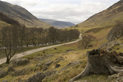
Lines lead the eye into a scene. Stand on a train platform and you'll see it's all but impossible to keep your eye from following the line of the tracks to the horizon. Parallel lines that appear to converge this way create what's known as one-point or linear perspective, potent for showing distance and depth in a photograph. Curved lines can lead equally well: The undulating lines of the country road draw the eye into the frame.
Leading lines are most effective when there is some relation between line and subject, such as winding stone steps leading to a castle door. You can exaggerate their impact further by using a wide-angle lens and finding a vantage point close to the beginning of the lines—kneeling to get close to train tracks, for example.
The shape and the direction of lines in a photograph are also forceful setters of mood. Straight lines, whether vertical or horizontal, seem stable and formal. The sharp lines of a picket fence have little sensuousness, but consider the alluring slopes of rolling hills or a tanned body lying on the beach.
Colors
The colors in an image and how they are arranged can make or break a shot.
Bright colors can add vibrancy, energy and interest – however in the wrong position they can also distract viewers of an image away from focal points.
Colors also greatly impact ‘mood’. Blues and Greens can have a calming soothing impact, Reds and Yellows can convey vibrancy ad energy etc.
Start trying these and wish you take wonderful photos :)
Tip : All the above rules are made to break too. Break it whenever you feel that would be better
Hi,
ReplyDeleteI am using Nikon coolpix s3200 . But in that configuration of vertical lines settings not found . Is that feature won't be available in all cameras or that vertical line concept is imaginary ?
Hi Ranju
ReplyDeleteIt is available in most of the digital cameras.
In your camera it can be enabled from "Monitor settings" option in "Set Up" Menu. Let me know if you have not found it.
Regards
Ashok